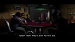
Trust me, i tried Inkscape and i gave up after 2 hours wasting my time with tutorials and lag from my computer. Also i'll try to update the fonts and straighten them in the next release. Zera commented over 11 years ago: If you want to vectorize them, I would recomend Inkscape. It's what I used to make the HD weapon icons for SA, it works wonders and it's easy to use.
And I can at least sympathize with the difficulty of making HD fonts for VC, since I attempted it once too. Needless to say, the result wasn't good enough to release.
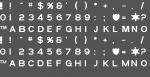
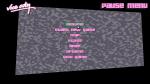
The Rage Itallic font available on the net does not even match the one used by Rockstar, which resulted in messed up fonts on locations such as Starfish Island (same problem in your current fonts). Zera: I tried my best to recreate it using just Adobe Photoshop CS6. It did however took hours to do and i have to find fonts to fit exactly since I don't have Adobe Illustrator. I wanted to vectorise it and then rasterise for perfect sharp quality but like i said, i have no Adobe Illustrator... Sorry about that. I'll try to align them properly. Zera commented over 11 years ago: Not a fan of these. It seems you didn't put that much effort into making sure the fonts matched the original exactly, which results in mispositioned letters on the screen. This appears to be a rushed job, no offence. And looking at the texture itself, you left the blurry original letters behind some of the high-res ones, which indicates a sloppy job on an editing program. There are many ways you can still improve this. Zaneski commented over 11 years ago: very nice cant wait View All Comments | Add Comment |